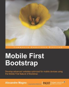
Mobile First Bootstrap

Book Details:
| Publisher: | Packt Publishing |
| Series: | Packt |
| Author: | Alexandre Magno |
| Edition: | 1 |
| ISBN-10: | 1783285796 |
| ISBN-13: | 9781783285792 |
| Pages: | 92 |
| Published: | Dec 18 2013 |
| Posted: | Nov 19 2014 |
| Language: | English |
| Book format: | |
| Book size: | 1.91 MB |
Book Description:
Develop advanced websites optimized for mobile devices using the Mobile First feature of Bootstrap Overview Get to grips with the essentials of mobile-first development with Bootstrap Understand the entire process of building a mobile-first website with Bootstrap from scratch Packed with screenshots that help guide you through how to build an appealing website from a mobile-first perspective with the help of a real-world example In Detail Bootstrap changes the way we develop websites in the frontend, and mobile web development has grown incredibly over the past few years. There are over 1.2 billion mobile web users in the world, and 25% of those mobile web users are exclusively mobile. Now, Bootstrap has also gone mobile-first. The mobile-first version of Bootstrap lets you first think about the mobile site and then think about how it expands to larger screens. To build websites for mobile devices that improve the overall experience of your customers, you need to be skilled at using the mobile-first feature of Bootstrap. Mobile-first Bootstrap covers the new features in Bootstrap 3 and focuses on how they affect development from a mobile-first perspective. It will show you how to use Bootstrap 3 for developing websites for mobile and how to use that knowledge for your own development projects. The book starts by highlighting the new changes that have been made to Bootstrap 3. After learning about these new features, you will discover how to easily build websites for mobile. You will learn how to run Bootstrap 3 Docs to customize Bootstrap for your needs. You will then be introduced to the new mobile grid system, the responsive utilities, and how to use mobile-first for navigation. Then, using JavaScript, you will explore the power of data attributes and progressive enhancement before starting to develop a web project from scratch. The last section of the book will discuss the main issues that affect the performance of Bootstrap as well as the issues that arise while dealing with responsive images. Mobile-first Bootstrap guides you through everything you need to know about Bootstrap 3 and helps you to understand and use the mobile-first approach in your own projects with the help of an example project. What you will learn from this book Develop websites using the mobile-first approach Use the new Bootstrap grid system Develop a mobile-first website from scratch with the help of a practical example of a live website Deal with responsive design performance issues Use Bootstrap as a kick-start framework to develop your websites for mobile, tablets, and desktop Learn the best design decisions to make your frontend scalable for any device Approach A practical, step-by-step tutorial on developing websites for mobile using Bootstrap. Who this book is written for This book is for anyone who wants to get acquainted with the new features available in Bootstrap 3 and who wants to develop websites with the mobile-first feature of Bootstrap. The reader should have a basic knowledge of Bootstrap as a frontend framework.
Download Link:
Related Books:
jQuery Mobile First Look
The jQuery Mobile First Look is a perfect reference to keep on your desk for finding out the capabilities of the jQuery Mobile framework and how you can put it to good use. This book will show you how to enjoy your programming by letting a simple yet effective JavaScript library handle the hassles you would encounter otherwise. It will quickly take you through the entire framework and cover every level of specification you need to know to kick-start your mobile web development. This is a First Look book that allows existing jQuery users to get a look at the features of jQuery mobile. It is targeted at jQuery users who want to enter the exciting world of mobile web development. All you need is the basics of jQuery and an interest to get involved with ...
Mobile First Design with HTML5 and CSS3
Roll out rock-solid, responsive, mobile first designs quickly and reliably Overview Make websites that will look great and be usable on almost any device that displays web pages. Learn best practices for responsive design Discover how to make designs that will be lean and fast on small screens without sacrificing a tablet or desktop experience In Detail The mobile first design philosophy aims to develop websites that will be lean and fast on small screens without sacrificing a tablet or desktop experience. Using HTML5, CSS3, and simple, standardized modern web tools you can make one site to rule them all. Mobile First Design with HTML5 and CSS3 will teach you the tools you need to make a modern, standards-based web page that displays beautifully on...
2007 - 2021 © eBooks-IT.org


