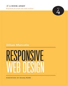
Responsive Web Design

Book Details:
| Publisher: | A Book Apart |
| Series: | MIX |
| Author: | Ethan Marcotte |
| Edition: | 1 |
| ISBN-10: | 098444257X |
| ISBN-13: | 9780984442577 |
| Pages: | 150 |
| Published: | Jan 31 2011 |
| Posted: | Nov 19 2014 |
| Language: | English |
| Book format: | |
| Book size: | 8.87 MB |
Book Description:
If you're hoping for a collection of tricks and tips for adding a little bit of superficial flair to the websites that you build, then keep looking, my friend. This little beauty operates at a deeper level. When you've finished reading this book (and that won't take very long) take note of how you approach your next project. It's possible that you won't even notice the mind-altering powers of Ethan's words, delivered, as they are, in his light-hearted, entertaining, sometimes downright hilarious style; but I guarantee that your work will benefit from the prestidigitation he is about to perform on your neural pathways.
Download Link:
Related Books:
Responsive Web Design by Example
Discover how you can easily create engaging, responsive websites with minimum hassle! Overview Rapidly develop and prototype responsive websites by utilizing powerful open source frameworks Focus less on the theory and more on results, with clear step-by-step instructions, previews, and examples to help you along the way. Learn how you can utilize three of the most powerful responsive frameworks available today: Bootstrap, Skeleton, and Zurb Foundation. In Detail Responsive web design is an explosive area of growth in modern web development due to the huge volume of different device sizes and resolutions that are now commercially available. You can now create your very own responsive website quickly and efficiently, allowing you to showcase your co...
Jump Start Responsive Web Design
Get a Jump Start on Responsive Web Design today! Responsive Web Design is redefining the way websites are designed, enabling you to craft websites that deliver exceptional experiences to your users - whether they happen to be using a desktop PC, tablet or mobile device. In just one weekend with this SitePoint book, you'll learn how to: Use media queries to maximize website usability Harness the power of fluid grids Use dynamic images to automatically scale and select appropriate images Plus you'll discover how to use responsive content and a mobile first approach....
Responsive Web Design with HTML5 and CSS3
Tablets, smart phones and even televisions are being used increasingly to view the web. There's never been a greater range of screen sizes and associated user experiences to consider. Web pages built to be responsive provide the best possible version of their content to match the viewing devices of not just today's devices but tomorrow's too. Learn how to design websites according to the new 'responsive design' methodology, allowing a website to display beautifully on every screen size. Follow along, building and enhancing a responsive web design with HTML5 and CSS3. The book provides a practical understanding of these new technologies and techniques that are set to be the future of front-end web development. Starting with a static Photoshop composit...
2007 - 2021 © eBooks-IT.org


